Joel Romero López
KAN
People nowadays are interested in getting to know the stories behind products. This proves that we are able to see much more within objects, than just aesthetics and function and that we not only desire products to make our lives easier, but also ones to make us feel something special.
When we grant particular objects with meaning and emotions, they get the power to transform our state of mind and have an impact on the real world. They can bring back memories and make us feel better instantly, being a reminder that our beliefs can make the invisible tangible.
In order to offer a satisfying product experience, objects and services must appeal to our senses and emotions. Using design and different types of media we are able to represent abstract ideas within products, their symbolic attributes stimulate our perception, while their functionality assures an incorporation into our everyday life.
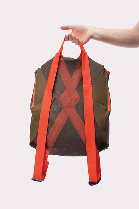
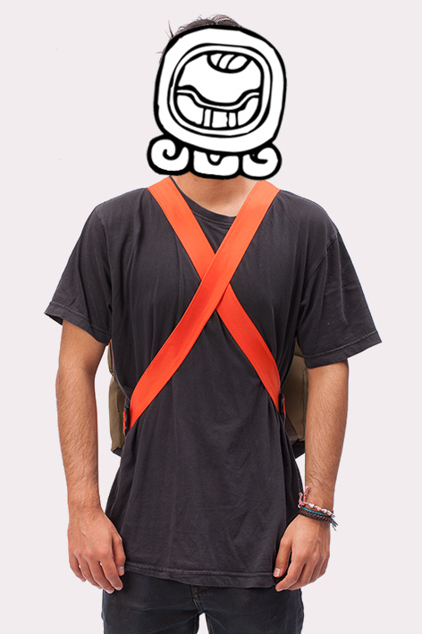
Kan: Being the mayan symbol of the awakening seed and reading also as “can” (verb of possibilities) this backpack is a metaphor for a germinating sprout, which is underlined by the different elements of the product like colors and shapes and a communication strategy, that objectifies the analogy between flowering plants and the awakening of the human mind.
There is even a real seed inside the backpack to let the metaphor become real and guarantee an awakening (flowering) effect on the user.
Anima
The concept of beauty is different in every culture and to every person. But there is a common tendency, regarding that beauty is a matter of looks and that it can be measured according to the stablished parameters of perfection.
But are we sure that imperfection lacks beauty?
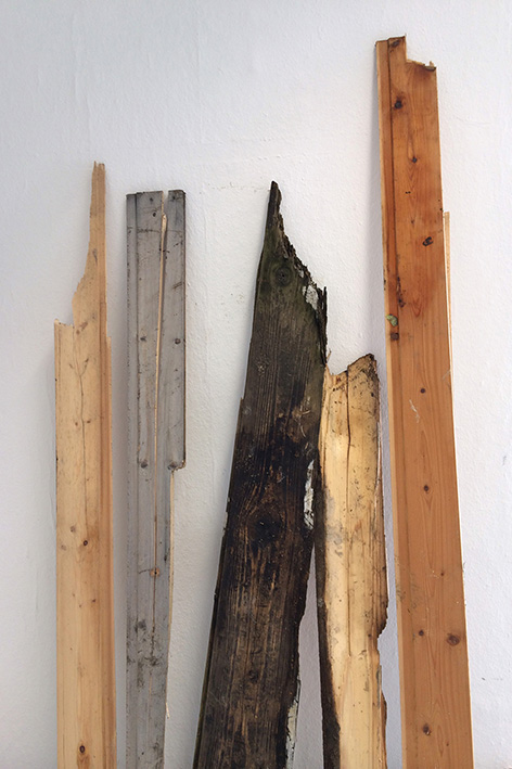
Patina is a good example on how imperfections can be an aesthetic attribute for materials used to make different objects. There is a certain charm and sincereness in something that has been created by uncontrollable means, such as weather conditions and outdoor exposure.
A wooden stool, is probably one of the simplest pieces of furniture there can be, so it works as a perfect example to demonstrate that the power of design doesn’t lie on the complexity of an object, but it’s ability, to let users discover and interact with things from different perspectives.
The wood used to build this stool was recollected from abandoned places and shows a damaged surface, while its core remains intact, this feature represents a metaphor for the misconception of beauty and the reanimation of things is a reminder that objects possess some kind of life as long as they are fulfilling a purpose.
Just by looking at this stool we get a melancholy feeling, for we are reminded of our own mortality.
2300 ml
We humans suffer from an obsession with order. Our mind is constantly looking for a logical pattern or structure in everything that ever crosses our path. This behavior is an appeal to our instinct; A natural mechanism for survival, to keep us safe from harm (safe from chaos).
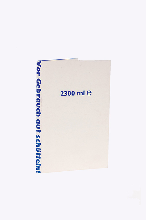
But order is just a construct, it exists only in our head because we believe in it. This book was conceived as an experiment to prove that. It has a well-structured design, to convince people that there is coherence and maybe even a story in it, but really it is rather absurd.
The whole content of this book was obtained randomly, using a set of cards to define what kind of text, color, size or image, were meant to be used. It is a compilation of instructions and ingredients of personal hygiene products which we use daily, combined with images of objects found with a dominant blue tone.
There is no beginning and no ending, and the only thing holding the book together, is it’s repeating structure: Image on the left, Instructions on the right and ingredients in the pocket between pages.
When people read the book for the first time, they tend to figure out a connection between the text and the image. Their mind, in an attempt to dissolve chaos into order, creates new interpretations and stories that didn’t exist yet.
Le MAG
The new digital media has taken over magazines and books, but technology is not necessarily replacing what is printed, it is expanding the forms of communication, reaching us through different platforms simultaneously. And there is probably no other field where this is more obvious than advertisement. We see campaigns in magazines, billboards, the T.V. and even our personal devices.
Short commercials last generally between 10 and 40 seconds and are a great example on how Motion Graphics are still a very popular way to make these.
“Le Mag” is about a fashionista guy that is transformed into a cartoon character and falls into the bi-dimensional world of a men’s fashion magazine, where products and outfits are changing constantly. At the end of his journey he meets three sexy Ladies and the party starts. Everything here is nonsense but at least they have champagne and good music.
The video required live footage from a chroma studio and 2D illustrations to be set together in post-production. Because there is no concept of room in this world, the scenery changes with different background colours.
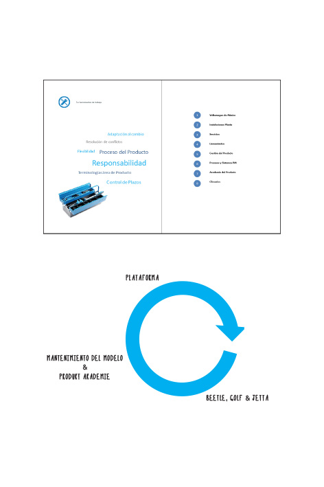
“Wissensstafette” Product Academy Volkswagen
To improve the performance of its employees, the Product Academy of Volkswagen Mexico, is interested in keeping both their technical and emotional skills to a good level. Good communication between team member, or the capacity to work under pressure are as important as an efficient work on the computer or mastering different languages.
It is important that every new employee on the product management, knows what’s required in this area. So that an introductory program would come in handy. The so called “Wissensstafette” is a method to transfer the knowledge between coworkers based on their own experience. So we created a small book, with all the necessary information in a very personal way.
Anthroposphere Workshop
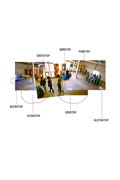
The main goal of this workshop was to demonstrate how creativity can be triggered by specific stimuli. We tested how fiction and discomfort can influence the way people work, on freshmen design students.
At the beginning the students were instructed to behave as if they were within a space station, no one could leave the ship without a helmet and a safety harness. The participants were divided in teams, and each team was given the task to design a specific room of the station, regarding the conditions in outer space. With the simplest materials, like paper, tape, and plastic film they crafted all the elements inside the ship, using imagination to turn everything into more complex objects, they were able to conceive lots of really useful and forward thinking products, because they didn’t see any limitations on the making process and that’s really how innovation works.
While all the teams where working, few participants were selected randomly to carry on tasks on their own, without the right tools and pretending to have a disability, for example being blindfolded or having to use only one hand. Having to solve problems in unfamiliar conditions, leads to unordinary solutions and teaches us how to detach from repetitive structures.
Design for a digital society
We know that human beings have had a spiritual side, since history can recall. All religions personify powerful entities that can overcome the limits of the terrestrial realm. Some people criticize smartphones or video games because they can detach us from reality. But really, this is exactly what our soul needs, from time to time. Being online dissolves the social stigmas and reality can melt with fiction.
-
Communication
-
technology
-
anthropology
-
metaphysics
